
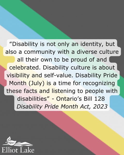
By Rosalind Russell – To kick off the month, the City of Elliot Lake has raised the Disability Pride Flag, designed by advocate Ann Magill.
According to the release, its’ colours and lines represent facets of various disabilities that people are affected by reflecting the diverse disability community.
Officials say the charcoal background represents morning the loss of ableism and the barriers faced by those affected while the diagonal band represents cutting through the walls and barrier that separate people with disabilities from society and the various colour bands represent different kinds of disabilities.
The flag is meant to show community inclusion means learning together and removing barriers every day while working toward a more accessible and welcoming community for everyone.
Officials say red represents physical disabilities and mobility impairments, gold for neurodiversity including ADHD, autism and learning disabilities, and white for invisible and undiagnosed disabilities. The blue is acknowledgement of psychiatric disabilities and mental health conditions while green highlights sensory challenges including blindness, low vision and deafness.
The Disability Pride Flag was originally designed by Ann Magill, an American activist with cerebral palsy, in 2016 with a rainbow lightning bolt design.
After feedback from people with visually triggering disabilities, Magill updated the design in 2021 to feature muted colors and straight diagonal stripes, making it safer and more inclusive for digital and physical displays.
Magill has waived her copyright, placing the flag in the public domain for free use and adaptation.
Poster provided by City of Elliot Lake


 Submit News Tip
